Best website designer
for a dermatology practice?
What to check before you hire: two labeled booking paths, insurance lines your front desk can stand behind, and one page per office.
The short answer
The honest answer
A patient worried about a mole that changed shape and a patient curious about a cosmetic consult often land on the same homepage. The best designer for your practice gets each of them to the right booking step: two labeled paths near the top, insurance and self-pay notes your front desk can stand behind, and booking connected to the system you already use.
WTM Studio is one option, with no dermatology site in our portfolio yet: a custom studio in Miramar, Florida, building nationwide, with founder Ray Hussain leading every project. You see a free homepage concept first, then get one flat quote in writing, and you own what we build.
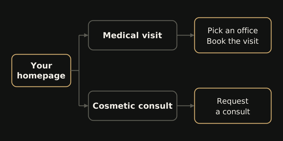
The first screen decides who stays
The mole patient wants proof that you see medical cases, and soon. The cosmetic patient wants to know what a consult involves. Neither should have to read past the other's content to find out.
A cosmetic promo at the top makes the medical patient wonder if you treat skin conditions at all. A wall of condition names does the reverse to the cosmetic patient, who starts to feel they walked into the wrong office. Some of both leave. Our post on why dermatology websites lose appointment requests traces where those bookings drop off.
A generic healthcare layout has one door. Your first test for any designer: does their sketch show two, side by side, near the top, each labeled for one kind of visit?
Where the medical and cosmetic paths part ways
The split should start on the first screen and hold all the way to the booking step. Ask the designer to sketch both routes before any visual design starts.
- Medical path: condition pages that match what people search, the providers who treat each one, an insurance note, and a booking or call button for the right office.
- Cosmetic path: treatment pages, what a consult covers, a self-pay note, and a consult request that asks a different first question than the medical form.
The paths can cross. Someone reading about acne care may decide they want a medical visit. Link across where it helps, but label every button for one kind of visit. A plain “Book now” on every page leaves the patient guessing which calendar they are on. Still deciding between custom work and a template? Read custom dermatology website vs template or platform.
Insurance and self-pay: say less, say it right
A medical patient often checks insurance before anything else, and a plan list nobody updates sends them in with the wrong expectation. A good designer will push you to publish only what your front desk keeps current.
| Situation | Safer wording | Avoid |
|---|---|---|
| Medical visits | We bill insurance for medical visits. Call the office to confirm your plan before you come in. | We accept all insurance. |
| Plans differ by office | Accepted plans can differ by office and provider. Check with the office you plan to visit. | One plan list for the whole group with no note |
| Cosmetic treatments | Cosmetic treatments are self-pay. We go over cost at your consult. | Prices or results your team cannot honor at every office |
Place the note beside the booking button on each medical page and office page, with tap-to-call on phones, not in a PDF. Check state board and FTC rules before you publish any health or cosmetic claim.
Ask this, listen for that
Bring these to every call. For a dermatology site, the answers tell you more than a portfolio from other specialties.
- Ask: “Where does a patient with a suspicious mole tap first, and where does a cosmetic patient tap first?” Listen for: two buttons on the first screen and two different booking steps behind them.
- Ask: “How do requests reach our front desk?” Listen for: a plan to connect to the scheduling system you already use, not a new tool for your staff.
- Ask: “What will you write about insurance?” Listen for: a question back about how your desk checks plans.
- Ask: “A request comes in for our north office. Where does it go?” Listen for: one page and one booking or call path per office, tested before launch.
- Ask: “Can you promise us page one?” Listen for: no. Anyone who guarantees rankings is guessing.
Collecting bids? Our website quote comparison helps you read them side by side.
Where WTM Studio fits
Our proof so far comes from dental and one medical aesthetics group, not from dermatology.
The closest match is Back to 30, a four-clinic medical aesthetics group in Upstate South Carolina: a 94-page rebuild with 44 treatment pages, four location pages, and booking and consultation paths. That mirrors the cosmetic half of a dermatology site, spread across offices. Northside Dental, a four-doctor family and cosmetic practice in Chicago, got a 26-page rebuild covering seven service lines, with insurance guidance, appointment requests and tap-to-call, the pieces a medical path depends on. A 9-location dental group we built for reported 18+ new patients in month one, and month two came in 17% above the group's usual monthly growth. Those figures are group-reported and do not prove the website alone caused them.
None of it predicts a dermatology result, so your free homepage concept arrives with both doors drawn in for you to judge. More on our dermatology website design page.
What it costs with us
Website redesigns with WTM typically run $6,000 to $30,000, one time. Your content, booking connections, number of offices and migration work decide where your flat quote lands. There is no required retainer, and you own what we build. Details are on our pricing page.