What should a dentist
website include?
Someone with a chipped front tooth types “dentist near me that does bonding and takes my insurance” and taps your site. Score it the way they see it: 20 checks, 1 point each.
The short answer
Four parts, scored in 20 lines
A dentist website should include a first screen with a labeled book button and a tappable phone number, one page for every treatment you offer, real photos and profiles of your dentists, and a booking path that reaches the right office. Everything else is optional until those four parts work on a phone.
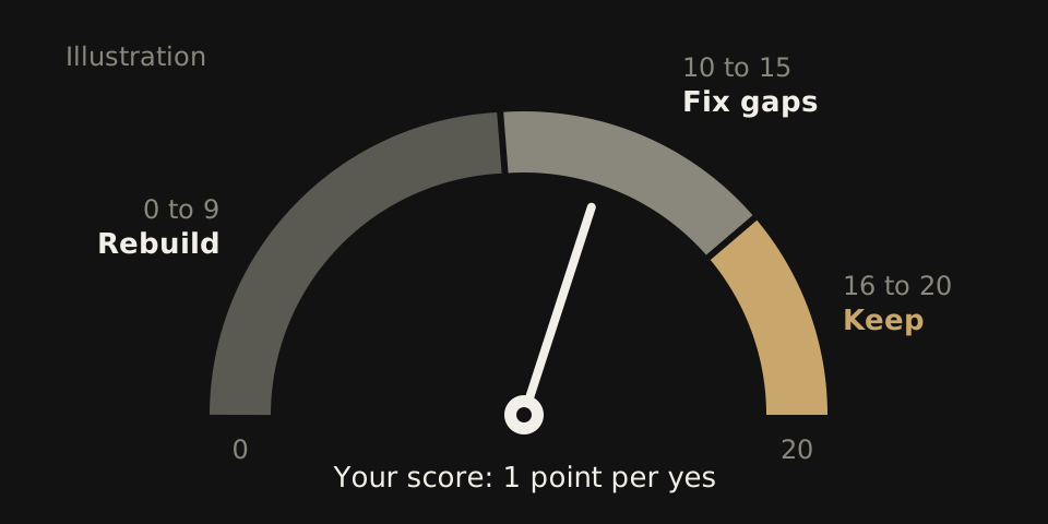
The scorecard below turns them into 20 yes or no checks. Open your homepage on your own phone in a fresh browser, give yourself 1 point per yes, then read your total against the three bands under the list.
If your total says rebuild, WTM Studio builds custom dental websites, and founder Ray Hussain leads every project.
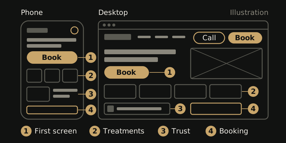
The scorecard: 20 lines, 1 point each
Score what a stranger would see, not what you know is there. If confirming a line takes more than one tap, score it 0.
| # | Score 1 point if |
|---|---|
| 1 | A button labeled Book, Schedule or Appointment is visible. Contact Us does not count. |
| 2 | The phone number is tappable in the header and opens the dialer. |
| 3 | The practice name and your city or neighborhood appear in the first lines of text. |
| 4 | No cookie notice, chat panel or promotion covers the book button on load. |
| 5 | The menu uses patient words: Treatments, New patients, Insurance, Contact. |
| # | Score 1 point if |
|---|---|
| 6 | One page per treatment, not one page listing eight. |
| 7 | Each treatment page says what the treatment does in plain words before any clinical terms. |
| 8 | Each treatment page has its own book button. |
| 9 | The treatments listed match what you offer today, with nothing you dropped years ago. |
| 10 | Each treatment page names the dentist who provides it. |
| # | Score 1 point if |
|---|---|
| 11 | Photos show your real dentists, team and office, not bought smiles. |
| 12 | Each dentist has a profile with a photo, their training and the treatments they provide. |
| 13 | An insurance page lists accepted plans, or gives the number to call if you cannot keep a list current. |
| 14 | A new patient section says what to bring, which forms to fill in and what the first visit covers. |
| 15 | The footer shows the same name, address, phone and hours as your Google listing, down to “Suite” versus “Ste”. |
| # | Score 1 point if |
|---|---|
| 16 | The book button opens a schedule or request form for the right office, or calls that office if it books by phone. |
| 17 | After a request, the patient sees a confirmation naming the office and the next step. |
| 18 | Every phone number is real text, not part of an image. |
| 19 | The booking form works with a phone keyboard: labels stay visible, errors say what to fix, and the keyboard does not hide the submit button. |
| 20 | Each office has its own page with address, phone, hours and a book button tied to its schedule. One office? Score your contact page. |
Running a group? Our DSO website design page lists what every location page should hold.
What your total means
0 to 9: a brochure, not a front desk
Patients can find your name and number, but booking takes work. A score this low usually means the structure is wrong: every treatment on one page, no booking path, or a platform you cannot edit. Those are rebuild problems, not copy edits. Our guide to why a dental website gets few new patients covers each failure point.
10 to 15: good bones, specific gaps
Fix the zeros in block order. Block 1 comes first because every visitor sees it. Most fixes at this level fit on the site you already have: a clearer button label, a phone number turned into a link, a promotion moved off the book button.
16 to 20: keep it and test what you cannot see
Send a clearly marked test request from a phone and follow it to the front desk. Then check that taps, requests and booked visits are counted as separate events. Our guide to online booking on a dental website lists what to ask about your scheduling system.
What 20 dental homepages showed on a phone
We loaded 20 dental homepages at phone size and recorded only what showed before any scroll. Of those, 15 showed an appointment-labeled control and 14 showed a call control. The other five had no appointment-labeled control in that first view, so a patient would have to scroll or open a menu to look for one.
That is why block 1 is scored first. Line 4 is there because a cookie notice or chat panel that loads on top can hide a book button the page does have.
The sample was small and not random, and it did not test whether booking worked. Method and data are in the mobile booking study.
What you can leave off
None of these earn a point, and each can cost you one.
- Sliders. A rotating banner puts several messages in one spot and pushes the book button down on a phone. Pick one message and leave it still.
- Stock photo walls. A grid of models with perfect teeth tells a patient nothing about who will treat them. Two honest photos of your real team do more for line 11.
- Autoplay video. A video that plays on load slows the page on mobile data and takes the space your book button needs. Put an office tour on its own page and let people press play.
What a complete build covers
Northside Dental shows the scale for one practice: our rebuild came to 26 pages covering 7 service lines. The count is not a target. It is what you get when each treatment has its own page. See the Northside Dental case study.
To estimate your own count, run the same math on a hypothetical practice. Say it has two offices, three dentists and seven treatments: cleanings, fillings, crowns, root canals, implants, clear aligners and whitening. That makes 7 treatment pages, 3 dentist profiles and 2 office pages, plus home, insurance, new patients and contact, for 16 pages before any blog posts. If that practice had 6 pages today, the 10 it is missing would be the brief.
Write your own list the same way, one line per page: the treatment or office, the dentist who provides it and where its book button leads. Anyone quoting the build can price from that list, and you can check the finished site against it line by line.
If you want us to build it
WTM Studio is based in Miramar, Florida, and builds nationwide. We start with a free homepage concept, then one flat quote, with no required retainer, and you own what we build. See pricing and terms or compare the quotes you already have.