Best website design
for an urgent care clinic?
A parent with a feverish kid opens your site on a phone after dinner. This guide shows how to test whether a design answers open or closed, which address and how to get seen, all on the first screen.
The short answer
Short answer: judge the first phone screen
Start with the five-second test: someone at night, phone in hand, glances at your homepage and needs one fact, open or closed. The honest answer is that the best urgent care design is whichever one passes that test, then shows the nearest address and how to get seen, with hours that are never out of date.
WTM Studio is one option: a custom studio in Miramar, Florida, that works with clients nationwide, and founder Ray Hussain leads every project. You see a free homepage concept first, then get one flat quote, and you own what we build.
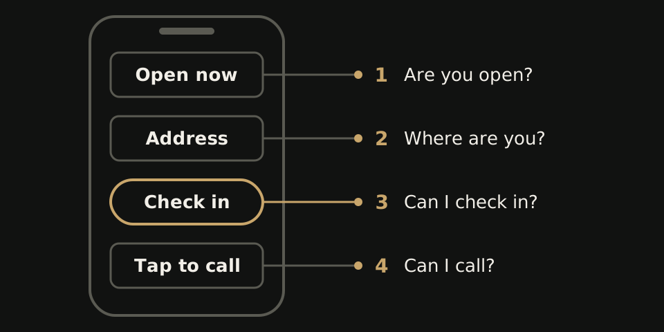
The five-second screen
Hand your phone to someone who has never seen your site. Give them five seconds on the homepage, then take it back. Ask three things: are you open right now, which address would they drive to, and how would they get seen? A stall on any one means the first screen is doing the wrong job.
Put the answers in this order:
- Open or closed, today. Say it in words with today's closing time, not a weekly grid someone has to read with a sick child on their hip.
- Where you are. The nearest center's address, with a link that opens the map app on tap.
- How to get seen. One button for online check-in, or one plain line that says walk-ins are welcome. Sometimes both.
- A number to tap. Some people want to ask a person before they drive over.
A short line telling people to call 911 in an emergency belongs up there too, in plain words your own medical and legal advisers approve. Our urgent care website design page shows how we lay this out.
Hours that are always right
Wrong hours do more damage than any layout choice. Picture a parent who drives to a dark building on a holiday morning because the site still showed regular hours.
Each center's hours should be typed in once and feed every spot that shows them: the homepage, that center's page, the footer and the location finder. Holiday hours should go in as a dated exception that switches back on its own when the day passes. Update your business listings the same day, so search results and your site agree; our local SEO checklist covers that side.
Every center also needs its own page with its hours, address, phone number and the services offered there. If one center does X-rays and the other does not, both pages should say so before anyone drives across town. Then ask your office manager how many places they edit when hours change. More than one is a design problem. We cover the other common leaks in why urgent care websites lose walk-in and booking visits.
Check-in versus walk-in wording
The label on your main button sets an expectation. Get it wrong and people arrive expecting a time slot that never existed, or skip you because they think they needed an appointment.
| Button says | The patient expects | Use it when |
|---|---|---|
| Book appointment | A fixed time they can plan around | Your system truly holds set times |
| Check in online | A place in line before they leave home | Your check-in tool holds a spot |
| Walk-ins welcome | No sign-up, just show up during open hours | You see patients with no prior check-in |
If you take walk-ins and online check-ins, show both, with the walk-in note right beside the button. Never promise a time your front desk cannot keep.
If your check-in tool shows waits or holds spots, the button should hand people straight into it for the right center. Put that connection in the written scope before work starts, so the site and the front desk always show the same thing.
What WTM can show, and what it costs
We build for healthcare practices. Our proof so far comes from dental and medical aesthetics work, not urgent care.
- Northside Dental, a family and cosmetic practice in Chicago with four doctors, got a 26-page rebuild covering its 7 service lines, with appointment requests and tap-to-call.
- An unnamed 9-location dental group got a new website, location pages and online booking. The group reported 18+ new patients in month one, and in month two new patients ran 17% above its usual monthly growth. Those are the group's own counts, and they do not prove the website alone caused the increase.
- Back to 30, a medical aesthetics group with 4 clinics in Upstate SC, got a 94-page rebuild with 44 treatment pages, a page for each clinic and booking one tap away on every page.
What carries over to urgent care is the structure: several locations, each with its own details and its own route in, kept accurate on one site. Judge us on the free homepage concept we show you before you commit.
On cost: website redesigns with WTM Studio typically run $6,000 to $30,000, one time. You see the concept first, then get one flat quote. There is no required retainer, and you own what we build. Details are on our pricing page.
Questions to put to any designer
Ask these on the first call.
- Open one of your past healthcare sites on my phone. What is on the first screen?
- Show me how a holiday closure gets onto the site. Who types it, and in how many places?
- If one of our centers stops offering X-rays, which pages change, and who changes them?
- Where does our check-in button send people, and who tests that hand-off on a phone before launch?
- Which words will our main button use, and why do they fit how we see patients?
- If we part ways, who owns the design, the code and the content?
- Who leads the work week to week? At WTM, Ray Hussain leads every project.
Holding more than one proposal? Line them up with our website quote comparison.